

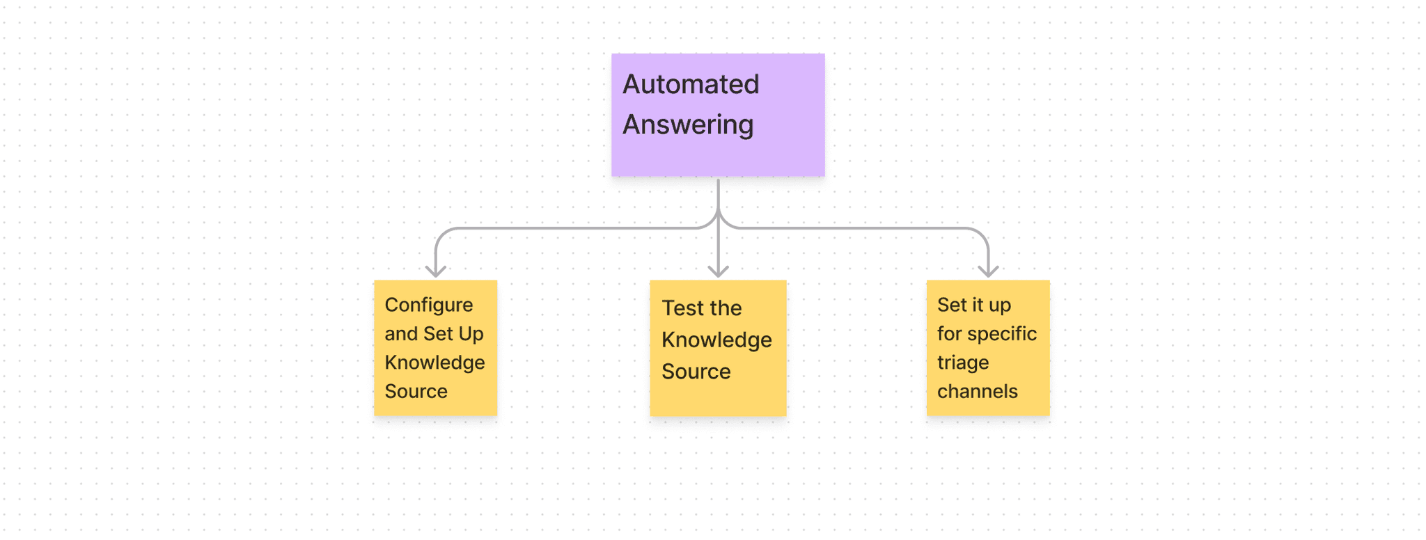
After user interviews, we identified demand of answering of slack queries using openAI. In accordance to which, in beta version, we enabled automated answering on slack queries by manually indexing knowledge sources of various companies. There was surge in demand in automated answering soon, since ChatGPT and Ai tools have made openAI very famous those days. So, this feature need to be put in webapp so that companies can configure, test and set it up on their own. There are 3 parts of the problem statement-
1. Configure and add the Knowledge sources (which would be used as base for automated answering)
Test it against some questions
Set it up for selected triage channels
We decided to support the Public and Confluence documentation at first. Data science and engineers were involved in understanding what fields would be asked to set up these Knowledge sources. Let me explain more of it later as well.
Type 1: Public
Mandatory Fields:
Root-URL
Excluded Path
Tags
Type 2: Confluence
Fields:
Space-ID
Page- ID
Tags
No Blacklist for now
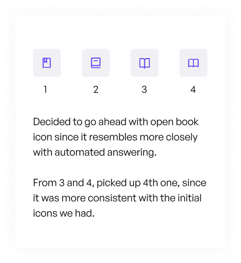
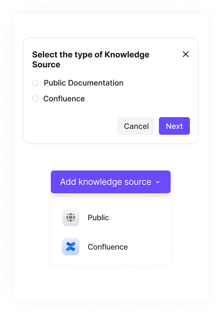
Starting with the icon, these were the few options which I was to choose from.
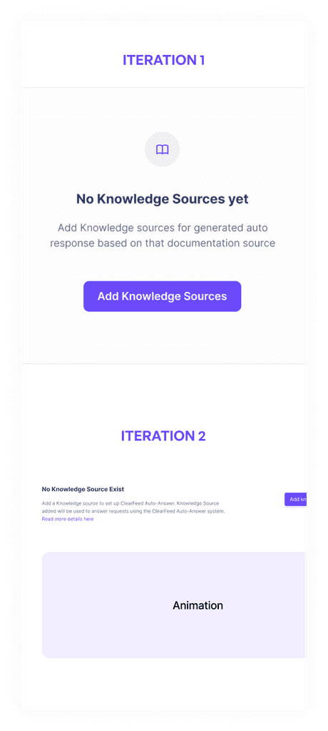
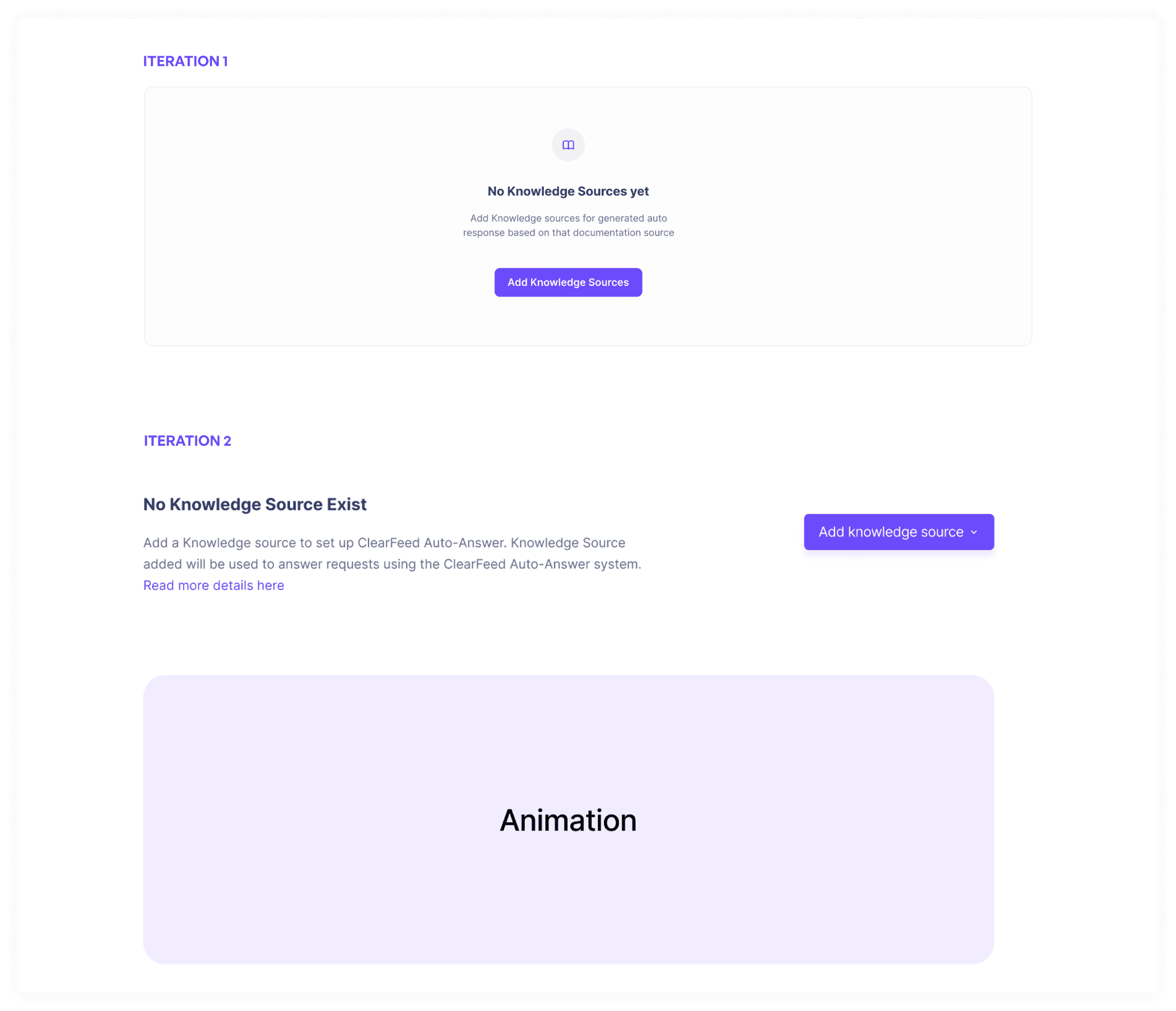
With the empty screen, we firstly created screen 1, but then we realised that people who are exploring it for the first time might not be able to get it. So we decided to add this animation in the empty state.
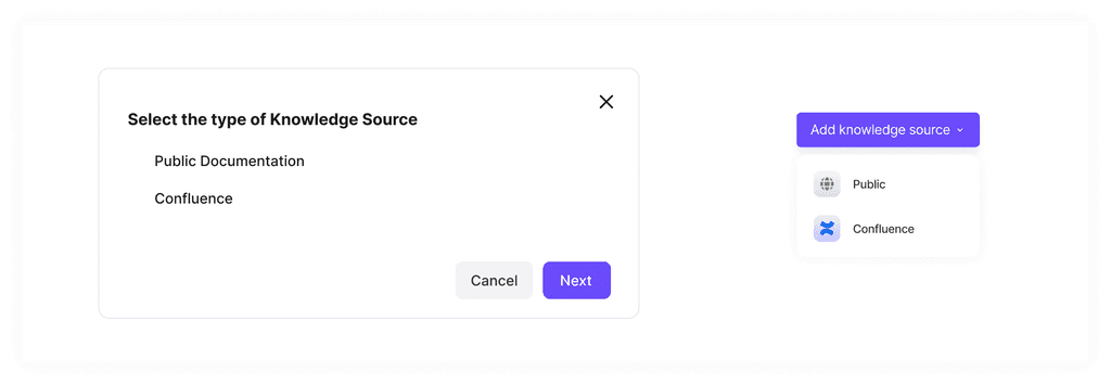
Selecting the type of knowledge also had two options. One is in the dropdown below and second is with a popup. Popup in this case seemed unnecessary since there weren't many options to choose from. In future, it might go to 5-6, not more than that.
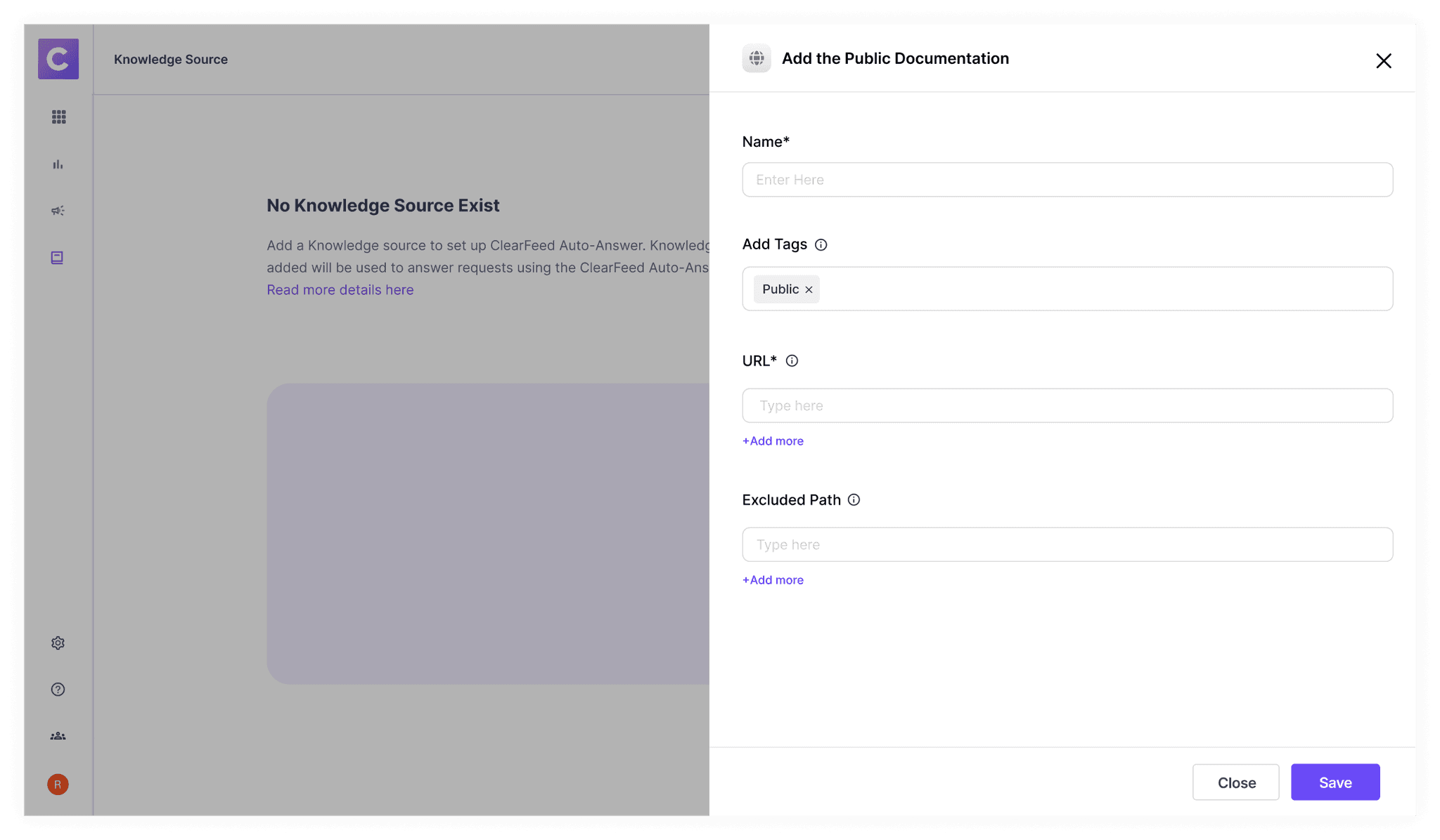
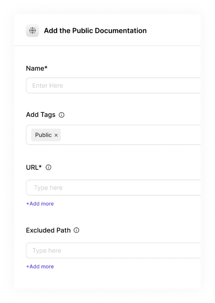
Public Docs Addition. We have added the question mark in case some people can't understand it on their own. There were 2 options either it could be modal or drawer. We picked up drawer since they are more scalable.
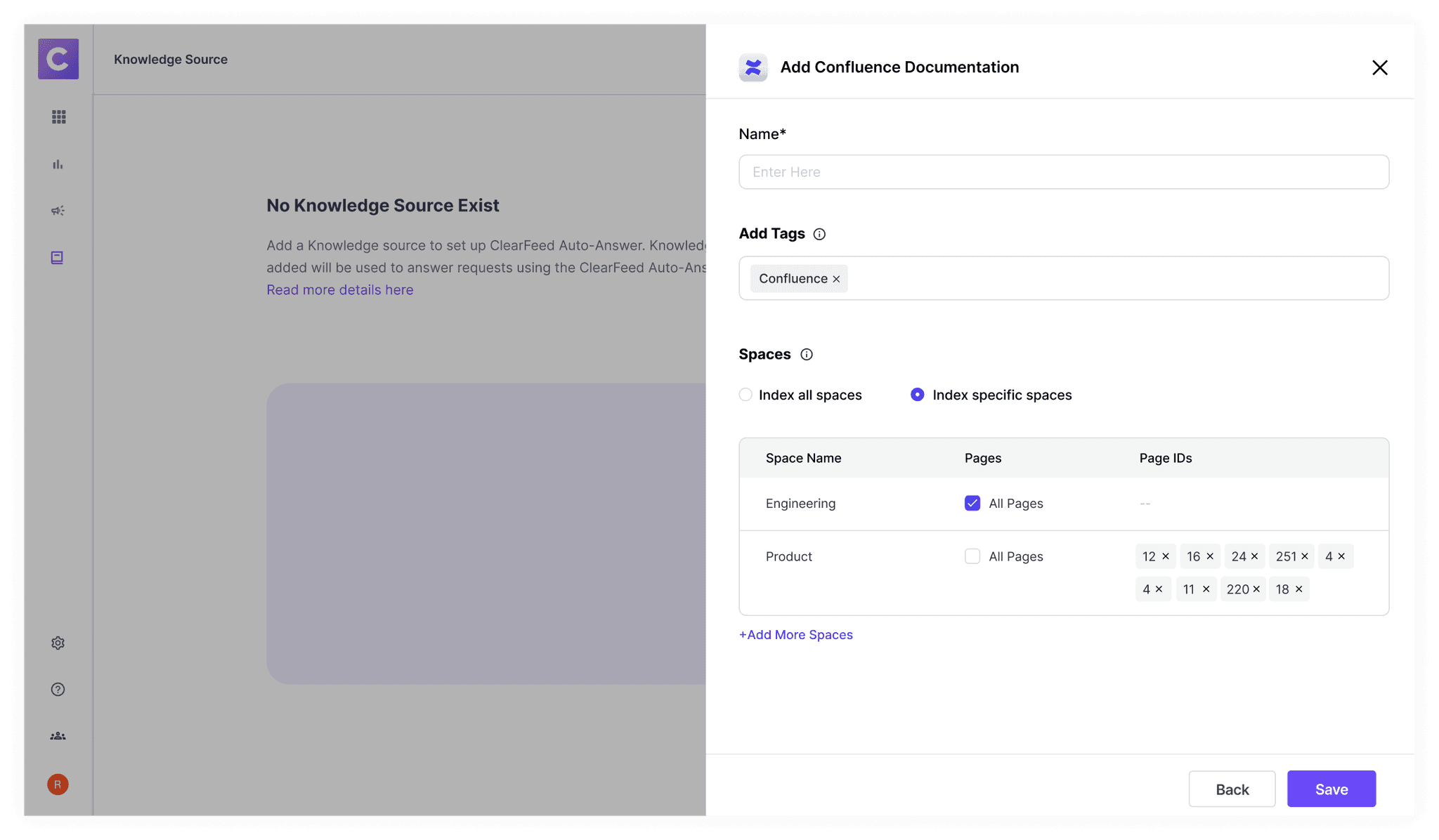
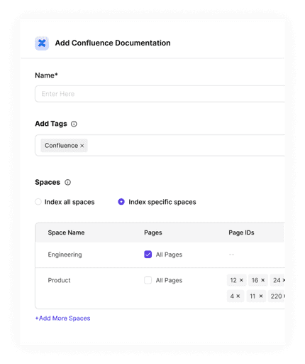
For Confluence, the fields were somewhat challenging to understand at first. Me and the product manager Rishi, collaborated with Data Science team to get them right. Each space ID would have few page ID. We wanted to give user the ability index all spaces and pages or some specific spaces with specific pages.
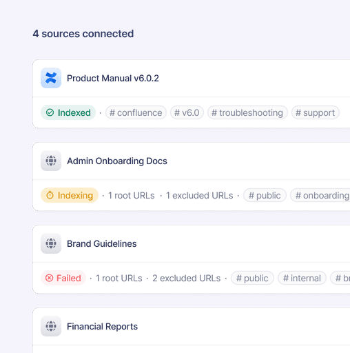
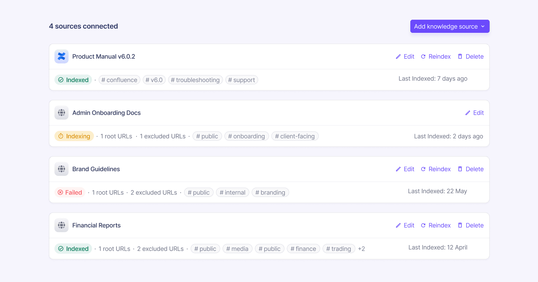
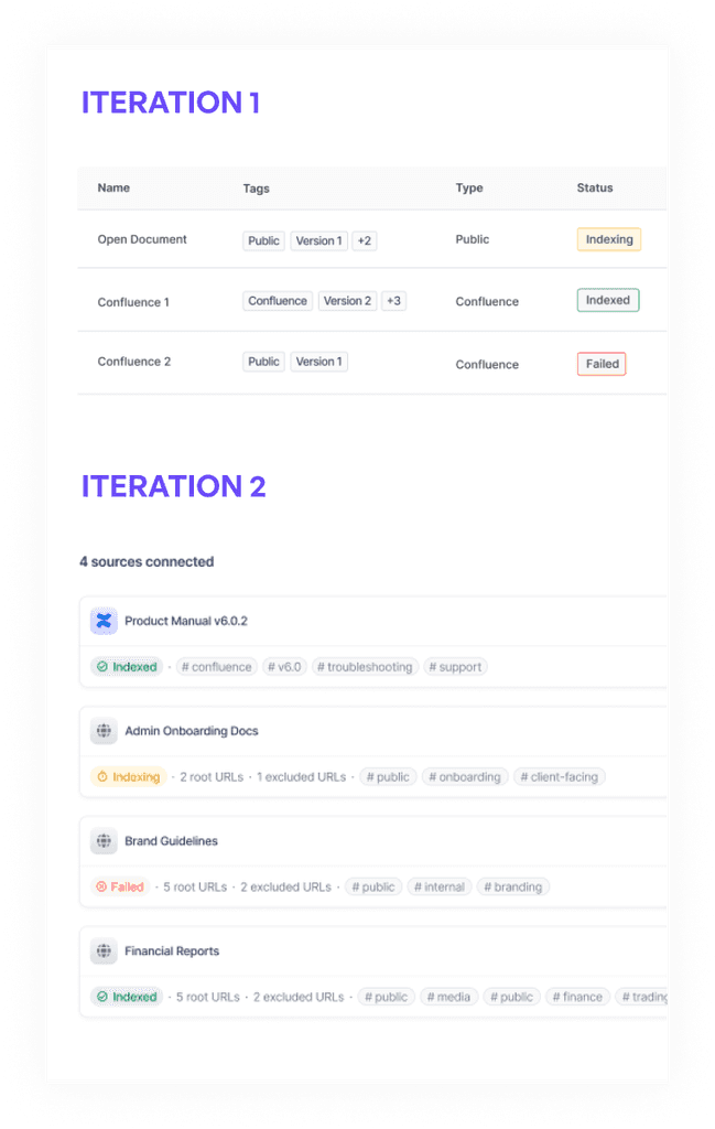
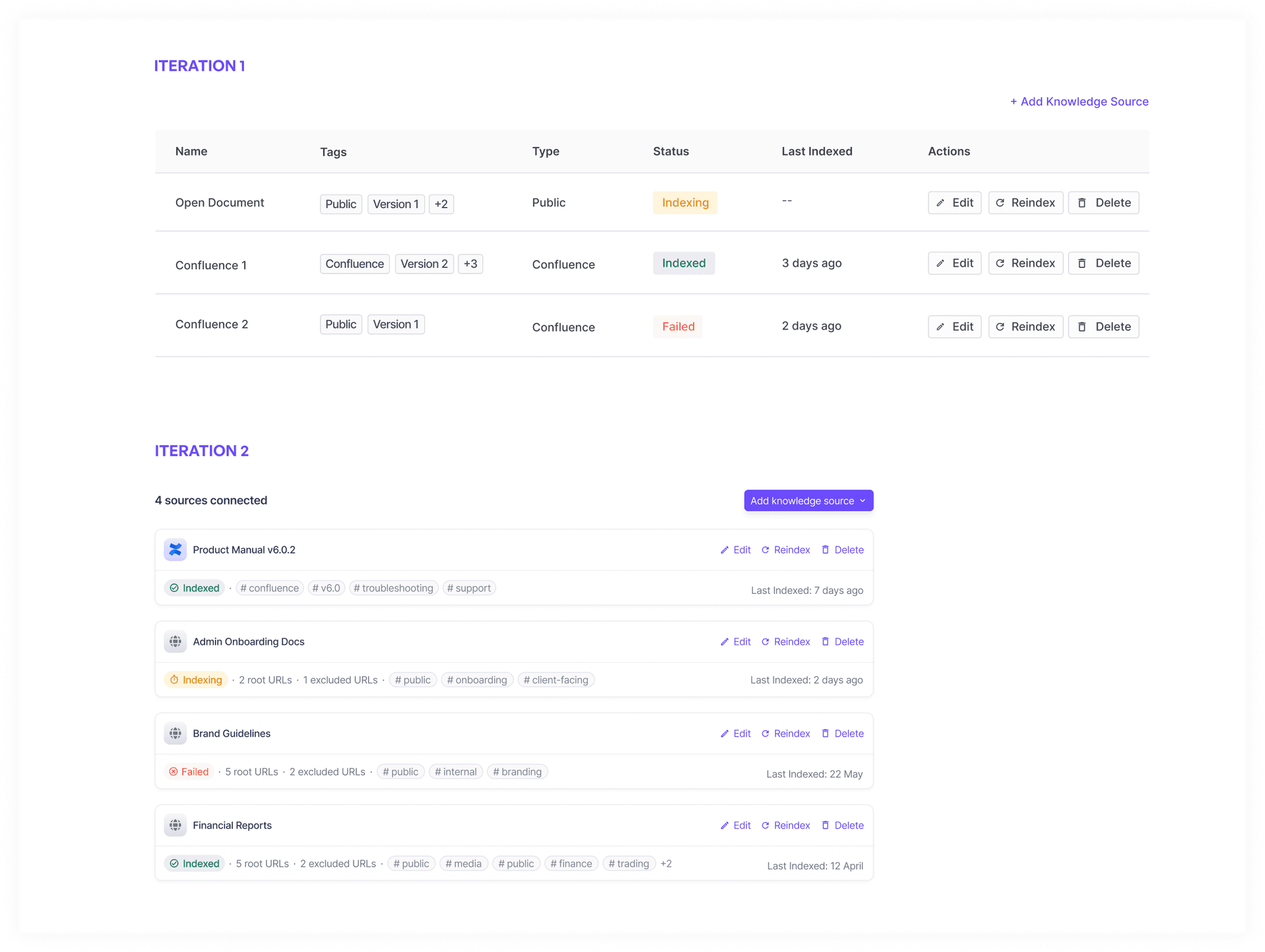
Once it is saved, in the first iteration we created a table entry with the following columns. But there was some problem with this design, since table wasn't able to contain all the information like the number of URLs and it could contain very limited number of tags. And since the entries would be like only 4-5, so having a table didn't made sense. So, I created new iteration with list view which made better use of space.
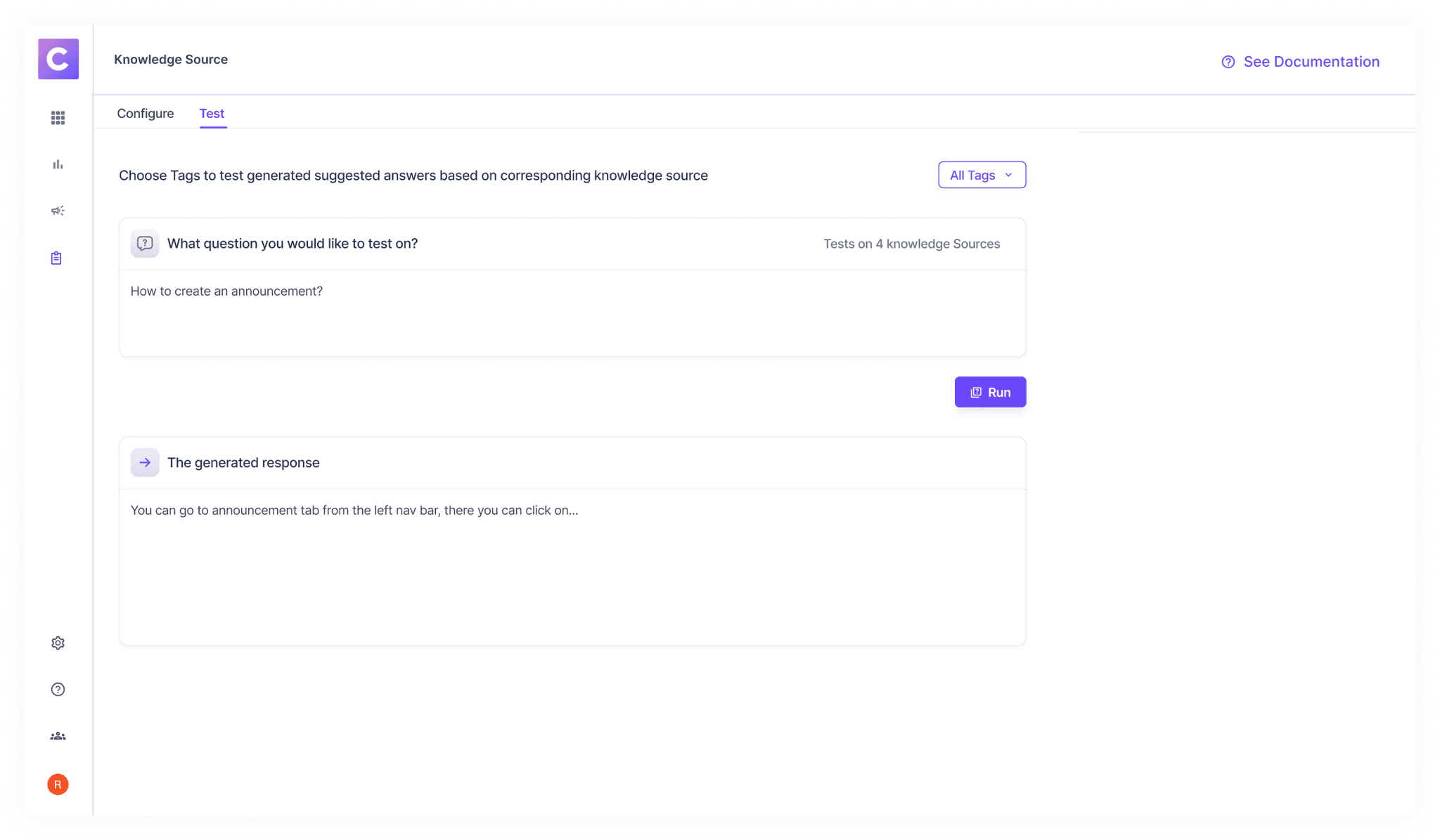
Part 2: Test Interface
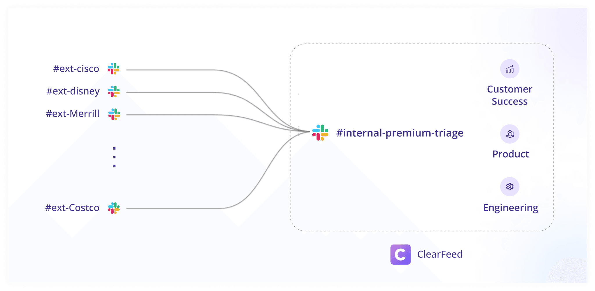
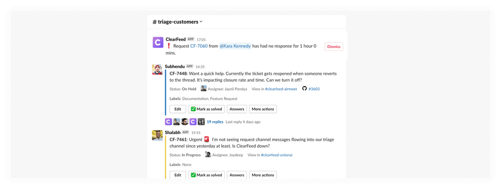
The other aspect of this problem statement was to build a seperate triage settings where users can turn on automated answers for specific triage channels. Let's recap on triage channels. So basically queries come from various customer channels, all of them get queued in separate channel named triage channels where you can see all requests at once
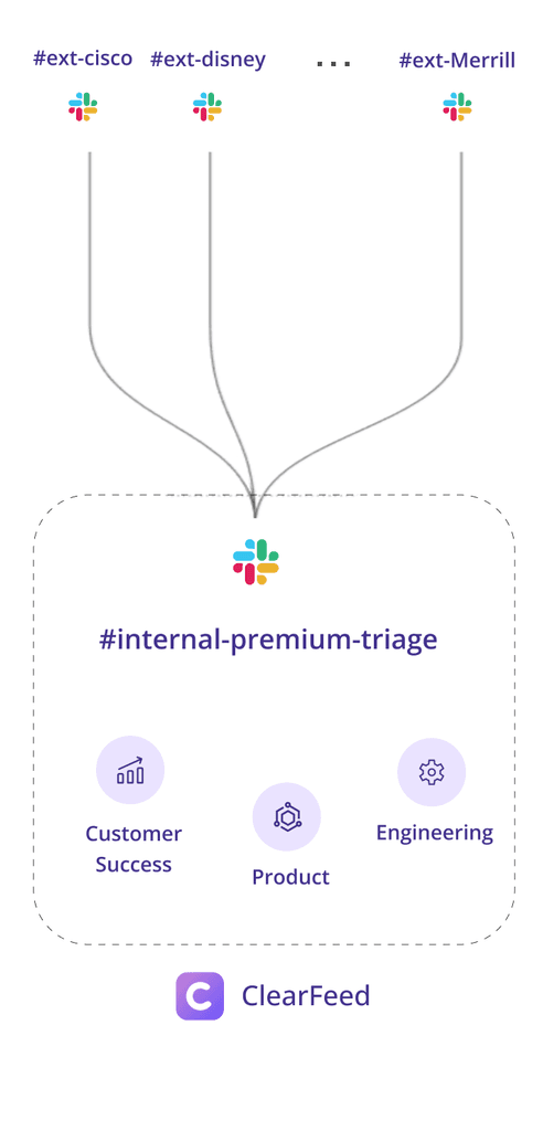
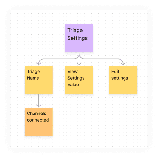
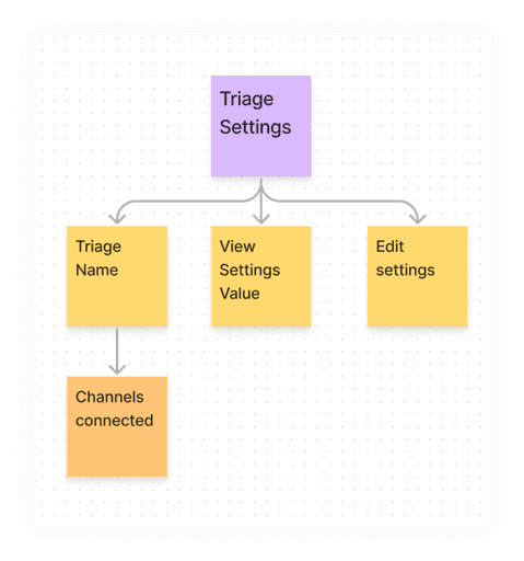
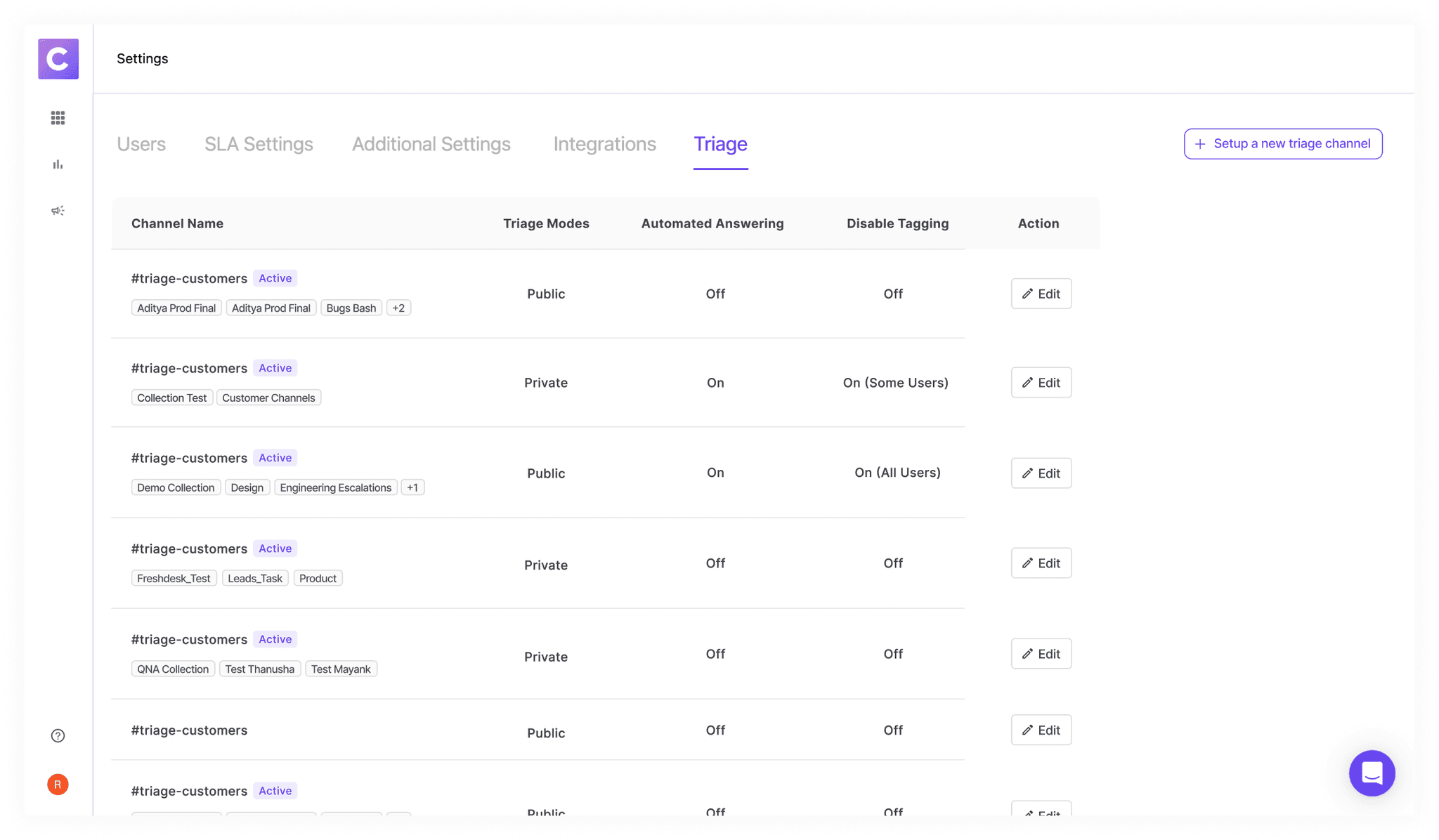
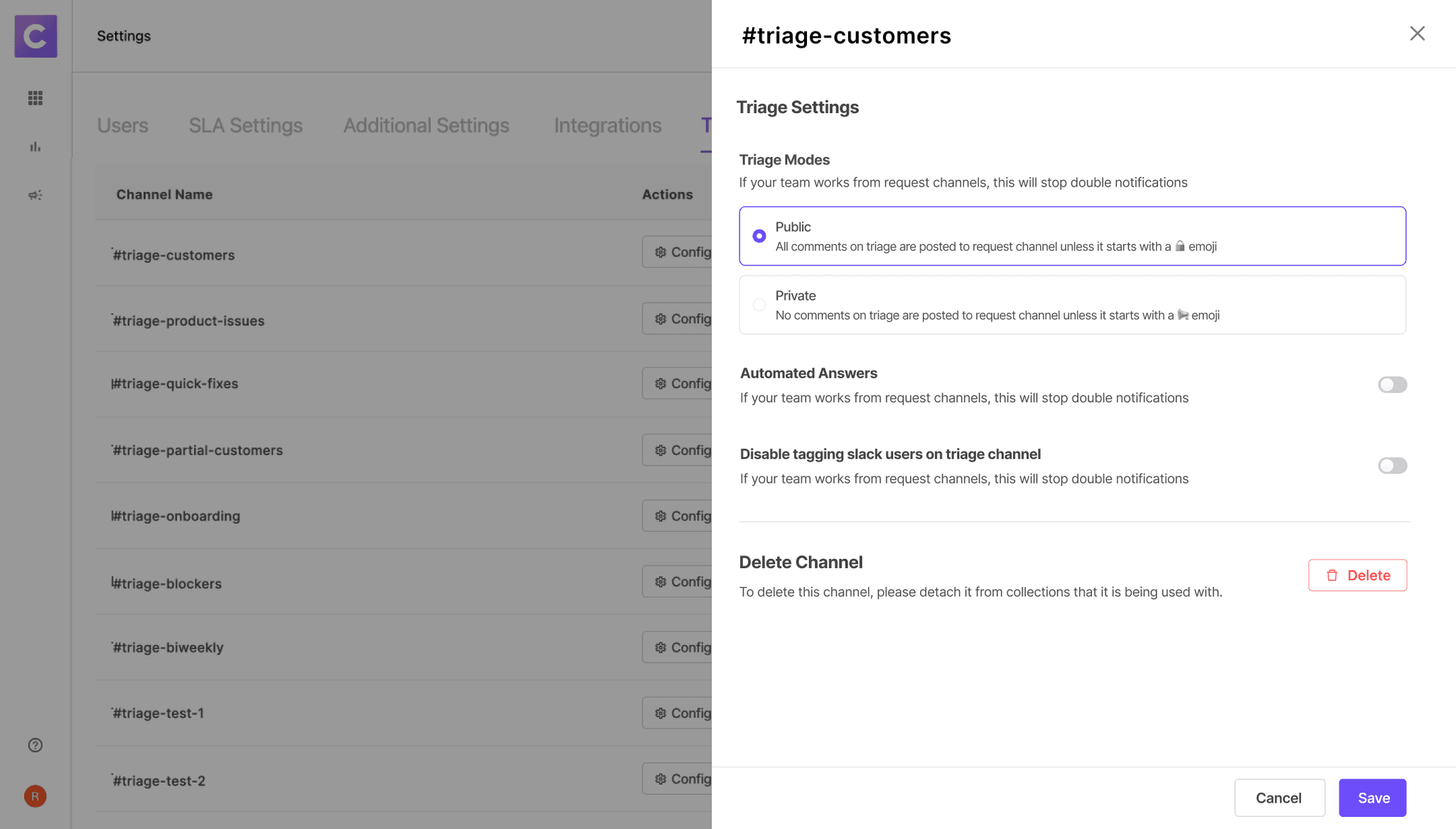
Bigger Picture- Entire Triage Settings
It would contain Triage Name, Channels associated with it, Settings assocIated with it, Ability to edit those settings.
There would also be an option to setup a new triage channel. I created these entire view and the settings associated with it.
Design Iterations
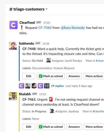
In this case study, let's talk about Automated Answering Triage Settings. On clicking edit, a drawer opens up with all the options to edit the settings. In first iteration, You can select tags through drop-down and see corresponding knowledge sources by expanding the accordion.
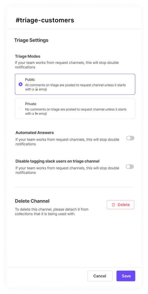
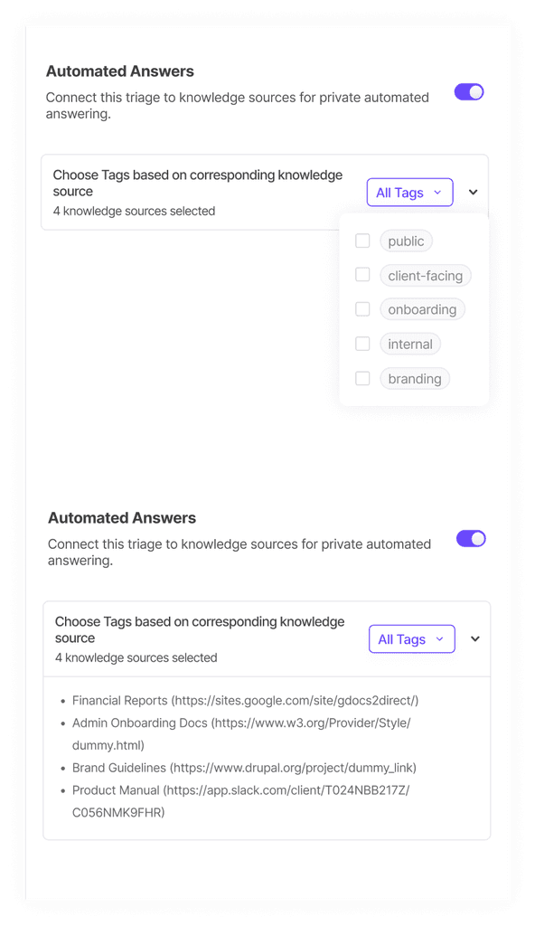
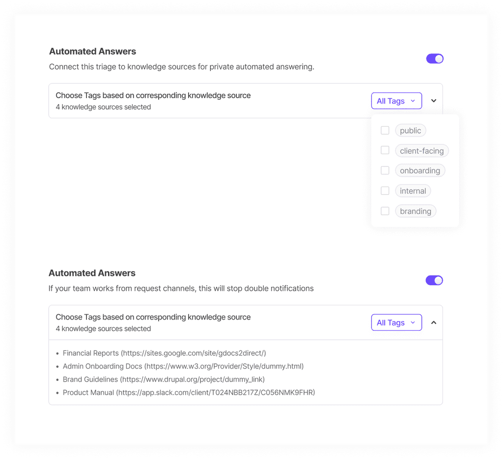
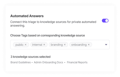
Feedback received on the above iteration was that we could directly show the tags on the screen without having to click on dropdown to see which tags are selected. And similarly for knowledge sources, we can directly show which knowledge sources are selected and can give the hyperlink to view the knowledge sources in depth.In the second iteration, I worked on the feedback and came up with this. This looked good to go ahead and test in the market.
We shifted the URLs succeeded and Errors to next phase since this was a lot for Phase 1. And we didn't wanted to spend months developing this. Backend changes required for this were too much. In phase 1, we also restricted the number of Root URLs to 1 and decided on not providing the option to index specific pages.
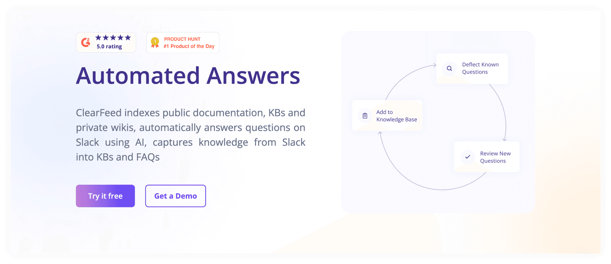
I also created the website page of this feature where I have tried to explain things with the help of animations and features. You can check it out here. https://clearfeed.ai/automated-answers
This is how the Hero section of this page looks though-
This feature is currently in development stage, don't have feedback from the market yet but it is quite understandable when we showed it to the other members of the team, who were not involved in the project.
Overall feedback from team
Overall team was happy with my work. Even founders wanted me to stay for longer because of the dedication and commitment I have shown in my work, due to this, I extended my 3 months intern to 7 months:)
Conclusion
In conclusion, my internship at Clearfeed has been a remarkable chapter in my journey as a product designer. I am deeply grateful for the invaluable opportunity to work alongside experienced product managers and collaborate with talented teams. As I move forward, I carry with me the knowledge and inspiration gained from this internship, and I eagerly embrace the challenges that lie ahead, armed with a passion for creating meaningful and impactful designs.